By: Thomas Burkel
What do you think of when someone says the word, data? Do you think of long numbers and convoluted spreadsheets? Well, that’s what I thought about. But data is more than just numbers, it’s a way of telling a story. How people place numbers, quotes, and text on a screen helps convey meaning. So, why is data so important and why am I talking about data in an NIL blog? Well, data is used in the world of sports all the time. What makes the scoreboard click, calculating shooting, win-loss percentages, these are all generated by numbers.
However, not everyone is interested in data. Some people are interested in how that data looks and how the story is told. That’s where infographics come into play. Infographics help tell the story of data in bite-sized pieces. According to Adobe, “an infographic is a clear and visual representation of data and information. Leaning on elements like imagery, symbols, charts, and diagrams, an infographic can make complex ideas easy to understand.” Infographics help shape the identity of the data and make it visual for a vast audience.
But, how do infographics tell the story of NIL? In this article, I will analyze two infographics that effectively communicate data and show how athletes can improve their brand.
Student Athletes and NIL Infographic – Vistex

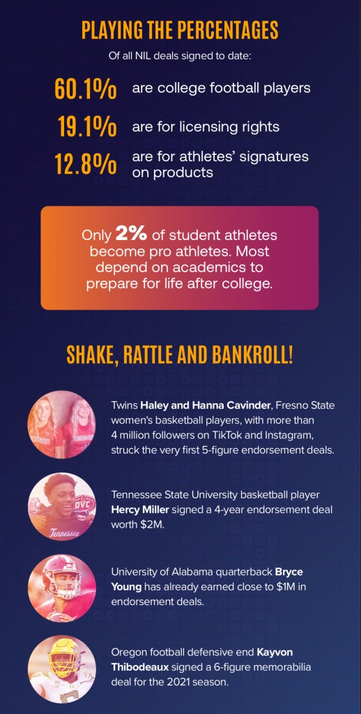
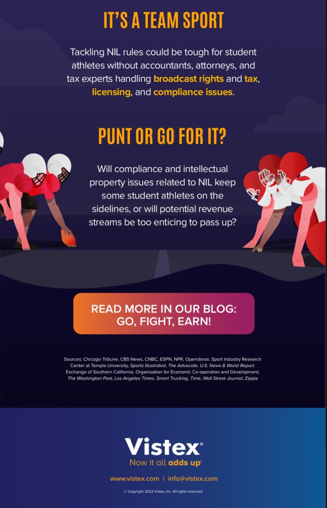
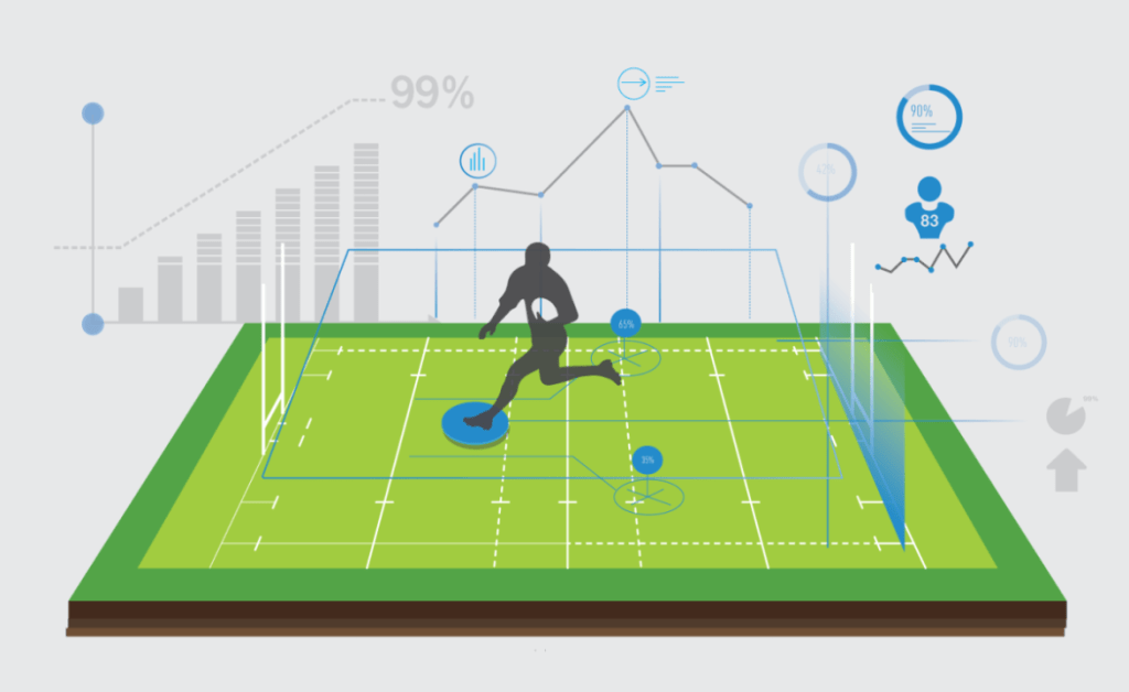
The first infographic that I will be analyzing is an infographic from Vistex. Vistex is a company that collects data and helps companies with their management solutions. Although the company doesn’t solely focus on sports, they do a great job of setting the scene and showing the growth of sports and branding through their data. Vistex completes all of the right steps in terms of its infographic. They have an engaging headline, colorful imagery, and factual data. As a reader, I know right off the bat what the company is trying to disclose to me.
To analyze the positives of this infographic, Vistex shows the reader exactly what they want to see. The infographic shows relevant statistics about what is going on in NIL. In particular, the company uses percentages and quotable information to give the reader a better grasp of the NIL landscape. They also use graphics and pictures of current student-athletes, bolded lettering, and captivating colors to hook the reader. As the target reader, I am easily able to understand that Vistex wants me to learn more about what NIL is and how it will shape the future of collegiate sports.
Although the infographic is useful, there are still some areas to improve upon. When it comes to infographics it is important to be short and to the point. It should be easy for the reader to take a glance and understand immediately the call to action. For this infographic, it is difficult to fully read their graphic. It is quite long and it is not compatible for someone on a mobile device. To read the infographic you have to be ready to scroll, which for the average consumer is quite difficult. The infographic also jams a lot of information onto one page. It would be helpful to see each area organized into different tables, or limited to a few hard-hitting sections that gets the point across.
Overall, the infographic does a great job of informing new athletes or sports fans about the NIL process. The NIL landscape can be complicated, so it is important to have an infographic that informs readers about this process. With a few tweaks, Vistex could have a fierce infographic that informs readers about NIL.
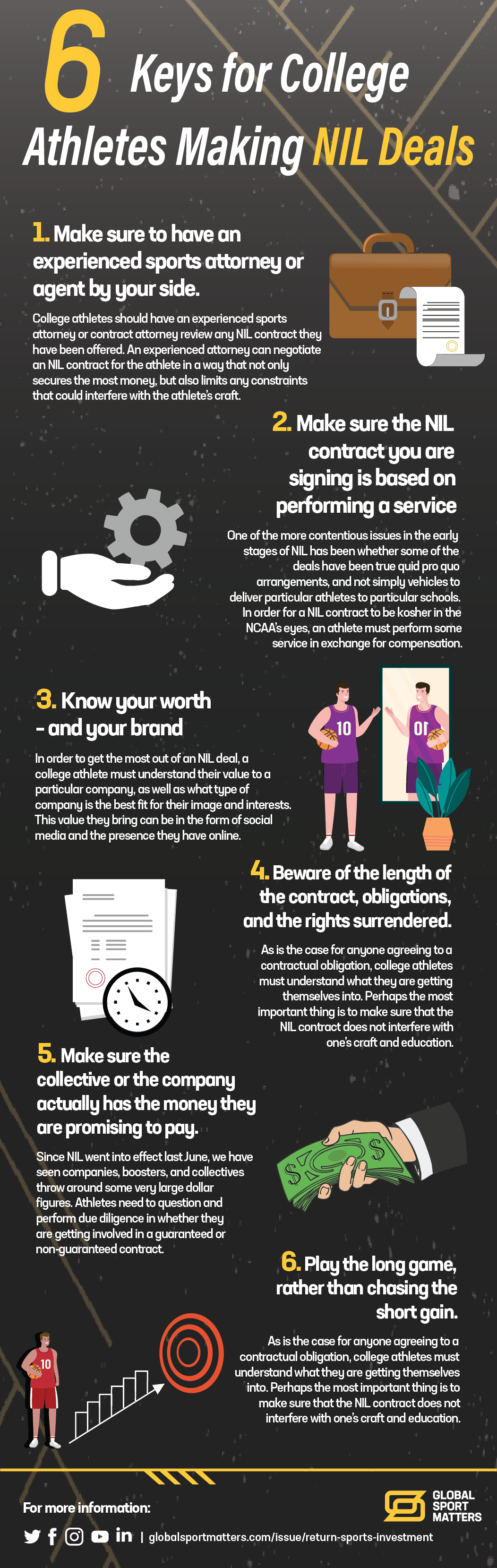
6 Keys for College Athletes Making NIL Deals – Global Sport Matters


Who doesn’t love a linear step-by-step infographic? I sure do! This infographic from the media platform Global Sport Matters (GSM) does an amazing job of breaking down the data in the infographic. Immediately it’s noticeable that GSM understands their audience. They know that this infographic is centered towards student athletes and they try to make it engaging for that audience. As an athlete, it is important to have a clear path in how to navigate NIL, and having an accessible infographic with this information is the key to success. Instead of focusing on charts, graphs, and fancy words, the infographic is straight to the point. This allows athletes, who are always on the go, to have informative information by their side.
The infographic by GSM instantly draws the reader with its catchy headline. Using numbers and descriptive language to hook the reader is always the way to go when writing an article, infographic, blog post, etc. The look and feel of the infographic is also made to perfection. The infographic is a perfect length, the images correlate with each step, and the words are accessible to a variety of readers. If I wasn’t a sports fanatic or a student-athlete, I would still understand what this infographic is trying to convey.
Although this infographic is flawless, in many senses, it still has minor problems. One of the main issues I have with the infographic is that there is not a clear call to action. What do you want student-athletes to do with this knowledge? Where should athletes go for more help? These are all helpful tools and pieces of information to put onto an infographic as it gives the reader a purpose. The infographic also lacks data. When creating an infographic you have to set the scene. In doing this you can use quotes, factual data points, or graphs. This helps back up the claim and gives more evidence as to why readers should follow the steps that are outlined.
Making informative infographics is a hard task, but it can be done. With NIL being so new, especially on a national scale, it is hard to grab data and statistics to tell a story. However, with deep research, understanding of the environment, and great storytelling this task can be done. In creating my work, when it comes to infographics, I will try and use captivating data, imagery, and headers to captivate my audience. It will be interesting to see how the future of NIL transforms storytelling, and how data and infographics can be used to narrate that story for future athletes.
Sources:
Adobe. (n.d.). What is an infographic? Examples, templates and how to make fantastic designs. Adobe Express. Retrieved May 18, 2025, from https://www.adobe.com/uk/express/learn/blog/what-is-an-infographic
Digicrome. (2023, September 26). How data science is changing the game for athletes. LinkedIn. https://www.linkedin.com/pulse/how-data-science-changing-game-athletes-digicrome-official/
Global Sport Matters. (2022). Student athletes and NIL opportunities [Infographic]. Global Sport Matters. https://globalsportmatters.com/wp-content/uploads/2022/09/infographicnil.png
Vistex. (2022). Student athletes and NIL opportunities [Infographic]. Vistex. https://www.vistex.com/infographics/Student-Athletes-and-NIL-Opportunities.pdf

Leave a comment